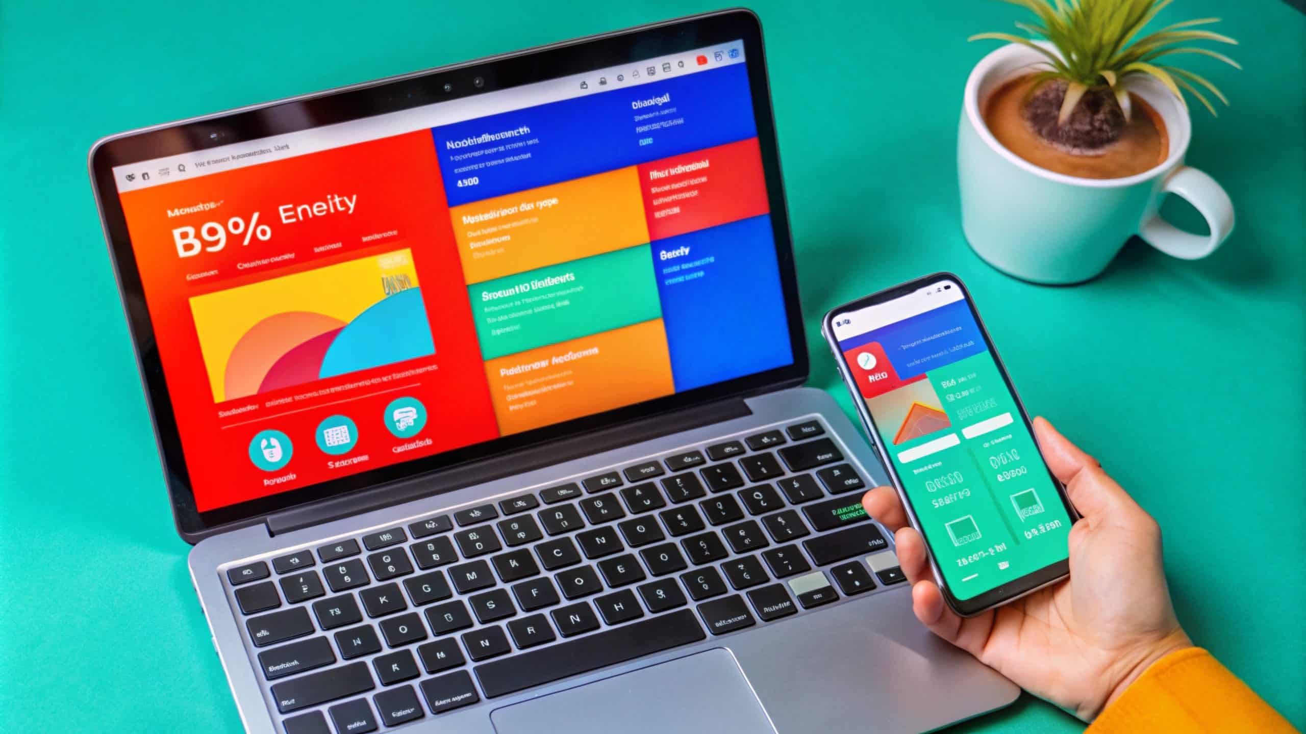
Did you know that more than half of all web traffic now comes from mobile devices? If your WordPress website isn’t mobile-friendly, you might be missing out on tons of visitors (and potential customers)! Don’t worry, though! Making your site mobile-friendly is easier than you think. Grab your favorite drink, and let’s dive into how to ensure your WordPress website looks fab on all devices!
Why Go Mobile-Friendly?
- User Experience: Imagine browsing a website, and everything is tiny and hard to
click. Frustrating, right? A mobile-friendly site provides a seamless experience,
keeping visitors happy and engaged. - SEO Benefits: Google loves mobile-friendly sites! A responsive design can improve your search rankings, making your site easier to find.
- Higher Conversions: Happy visitors are more likely to turn into customers. A mobile-friendly site can boost your conversion rates!
Step 1: Choose a Responsive Theme
What to Do:
Start with a responsive WordPress theme. This means your website will automatically adjust to fit any screen size! Check out popular choices like Astra, GeneratePress, or OceanWP.
Quick Tip:
Look for themes that come with “responsive” features listed.
Step 2: Optimize Image Sizes
What to Do:
Large images can slow your site down, especially on mobile. Use image optimization plugins like Smush or ShortPixel to shrink those file sizes without sacrificing quality.
Quick Tip:
Aim for images that are 1080 pixels wide or smaller for mobile devices.
Step 3: Use a Mobile-Friendly Menu
What to Do:
Mobile devices have limited screen space, so a cluttered menu can be a headache. Keep it simple! Use a hamburger menu (the three lines icon) to save space and provide easy navigation.
Quick Tip:
Consider placing your menu in the header for easy access users love convenience!
Step 4: Test Mobile Usability
What to Do:
Before you go live, test your site’s mobile usability! You can use Google’s Mobile-Friendly Test tool to see how your site performs on mobile devices.
Quick Tip:
Check the loading speed if it takes longer than three seconds, that’s a red flag!
Step 5: Keep Your Content Easy to Read
What to Do:
Fonts that are too small can be a major turn-off. Opt for larger font sizes (at least 16px) and high contrast between text and background for better readability
Quick Tip:
Break text into smaller paragraphs and use bullet points or headings to make skimming easier.
Step 6: Consider AMP (Accelerated Mobile Pages)
What to Do:
AMP simplifies your pages to make them load faster on mobile devices. You can easily implement AMP by using the official AMP plugin for WordPress.
Quick Tip:
While AMP is great for speed, make sure your branding doesn’t get lost in the process!
Wrapping It Up!
That’s it, folks! By following these steps, you’ll make your WordPress website mobilefriendly and ready to welcome visitors from any device!
Now, we want to hear from you! Have you made your website mobile-friendly
Contact Us Today: www.bytesparkdigital.com/wordpress
Let’s bring your vision to your project!